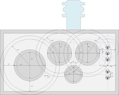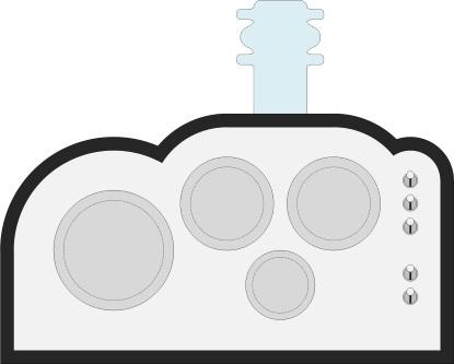


Before we plunge headfirst into the fray with gusto and abandon, I thought you might be interested in seeing just how much thought goes into this sort of thing. I don't know how professional designers set about something like this -- it may be that they can simply fly by the seat of their pants and "eye-ball" things -- but I have to do things the old-fashioned way. Thus, my starting point looks something like the following:

Just to set the stage if you're seeing this for the first time, the large (4.5" diameter) antique analog meter on the left will display the hours, the two medium-sized (3.5" diameter) meters located toward the upper right will present the minutes and seconds, and the small meter will act like a mini-metronome, swinging back and forth in time with the tick-tock sound we'll be generating.
For the front panel itself, we’ll be using an amazing wood veneer with an aluminum look-and-feel (click here to see an image of this veneer). The top, bottom, and sides of the cabinet will be 0.5" thick and made of ebony (or, more likely, regular wood with an ebony veneer). Can you imagine how the polished black ebony of the cabinet will play off the black surrounds of the antique analog meters?
On top of the clock will be an antique vacuum tube illuminated from below by tri-colored LEDs, whose colors and patterns will reflect the mode and mood of the clock (click here to see a picture of this tube). The clock itself will sit on a stand with legs, but we'll leave the design of that stand as a project for another day.
Also on the front panel will be five antique steel switches, which will be used to select the operating mode and sound effects used by the clock (click here to see these little beauties). We will be considering alternative operating modes and associated sound effects in a future column.
Observe that the bottoms of the two medium-sized meters sit on top of the horizontal centerline from the large meter; similarly, the top of the small meter is aligned with the centerline from the large meter.
As one final point before we get to the "good stuff," observe the large circles surrounding the large meter and the two medium meters. The way in which I arrived at the size of these circles was to take the diameter D of each meter, divide it by 3 to give D/3, and then make the diameter of the surrounding circle 5 * D/3. That is, the gap between the edge of a meter and the edge of the surrounding circle is 1/3 bigger than the diameter of that meter, if you see what I mean.
OK, keeping all of the above in mind, we arrive at Option 1 as shown below. In this case, the switches are spaced 7/8" center-to-center. Observe the little red circle on the upper-left-hand side of the image. Let's call this point P1. Now follow the dotted line horizontally to the right until you reach the second little red circle on the upper-right-hand side of the image. Let's call this point P2. The 2.25" diameter "imaginary circle" (whose center is located somewhere between the top-most pair of switches) is positioned such that its circumference intersects the circumference of the 2 7/8" diameter circle surrounding the right-most medium meter at point P2.


The idea behind the above implementation was that it might be preferable for the two points in the ebony surround located at points P1 and P2 to be horizontally aligned. However, this does result in the fact that the peak of the ebony directly above the middle of the main meter will be higher than the peak of the ebony directly above the middle of the switches. It also results in the top-most switch appearing to be a bit "crunched in" to my eye.
The next alternative is as shown below. In this case we've centered the 2.25" diameter (1 1/8" radius) circle on the center of the top-most switch. This means that the high points of the ebony directly above the large meter and the top-most switch are at the same height -- and also that the top-most switch no longer appears to be "crunched in" -- but now the two low points in the ebony are no longer aligned.


I was comparing and contrasting the advantages and disadvantages of Options 1 and 2 when I recalled someone posting a comment to an earlier blog suggesting that we try swapping the switch groupings such that we have the two-switch group on the top and the three-switch group on the bottom. I think the idea was to counterbalance the "heaviness" of the large meter with the "lightness" of the two-switch group while also balancing the "lightness" of the small meter with the "heaviness" of the three-switch group. "Hmm," I thought, "let's give this a whirl." The result is as shown below.


In the above implementation, I'm still using the original center-to-center switch spacing of 7/8", which I find pleasing to the eye and which visually emphasizes the fact that the switches form two distinct groupings. Also, I've once again centered the 2.25" diameter (1 1/8" radius) circle on the center of the top-most switch. The end result is that point P2 (the small red circle to the right) is 1/16" lower than point P1 (the small red circle to the left).
Would anyone actually notice this 1/16" discrepancy? I don't know. Furthermore, since this cabinet is going to be made by hand, the chances are that there will be discrepancies of 1/16" or more all over the place whatever we do. At the end of the day, the important point is that yours truly would know about this issue, and I'm the one who has to live with myself -- and this clock -- until the end of my days. This led to Option 4 as shown below.


What we've done in the above implementation is to increase the center-to-center chip spacing from 7/8" to 1", which raises the center of the top-most switch by 1/16", thereby ensuring that points P1 and P2 are perfectly aligned. But now I stated to worry that the switches no longer give the impression of being two distinct groups, which led to Option 5 as illustrated below.


The only difference between Options 4 and 5 is that the center-to-center spacing for the bottom group of three switches in Option 5 has been reduced to 3/4". But now I'm concerned that (a) it looks weird having different spacing for the two groups of switches and (b) the bottom three switches are too close together and it will be hard to manipulate them.
I don’t know about you, but my heart hurts. Selecting between these options is proving to be really difficult. Let's bring them all together for a final side-by-side (or top-to-bottom) comparison as shown below.

So there we have it. Is it better to have the two peaks of the ebony over the main meter and the top-most switch horizontally aligned, or is it preferable to have the two dips in the ebony horizontally aligned? The entire face of the clock has a pleasing (to my eye) asymmetry to it -- whichever way we go will simply add a little more asymmetry to one facet or another.
I'm in a bit of a quandary about this. I may be over-thinking things (of course this would complement the way in which I always over-engineer things). So, what do you think? Which of the above options is the way to go? All comments welcome below.
Actually, by clicking here you can access a PDF containing the non-annotated images for these options along with a survey form. It would be wonderful if you could print this out, show it around your family, friends, and/or work colleagues, and ask them which they prefer (without you explaining any of the nuances). If you share with me the results, it will be interesting to see how many people favor each alternative.
 /5
/5 
文章评论(0条评论)
登录后参与讨论